
Team: Jemma Yang, Karthik Srinivasan, Kaylin Broussard, Yujia Wang
Duration: Aug 2017 - Dec 2017
Key Words: Universal Design, Clothing Shopping, Mobile Application
My Role: UX Design, UI Design, Usability Testing
Despite the Americans with Disabilities Act (ADA), and accessibility services available at clothing stores, there are still many issues wheelchair users face when purchasing clothing in stores.
Accessible fitting rooms can be particularly frustrating for wheelchair users. Often they are left messy or used for stock and storage. It's also common for users without disabilities to use these rooms, forcing wheelchair users to wait in line.
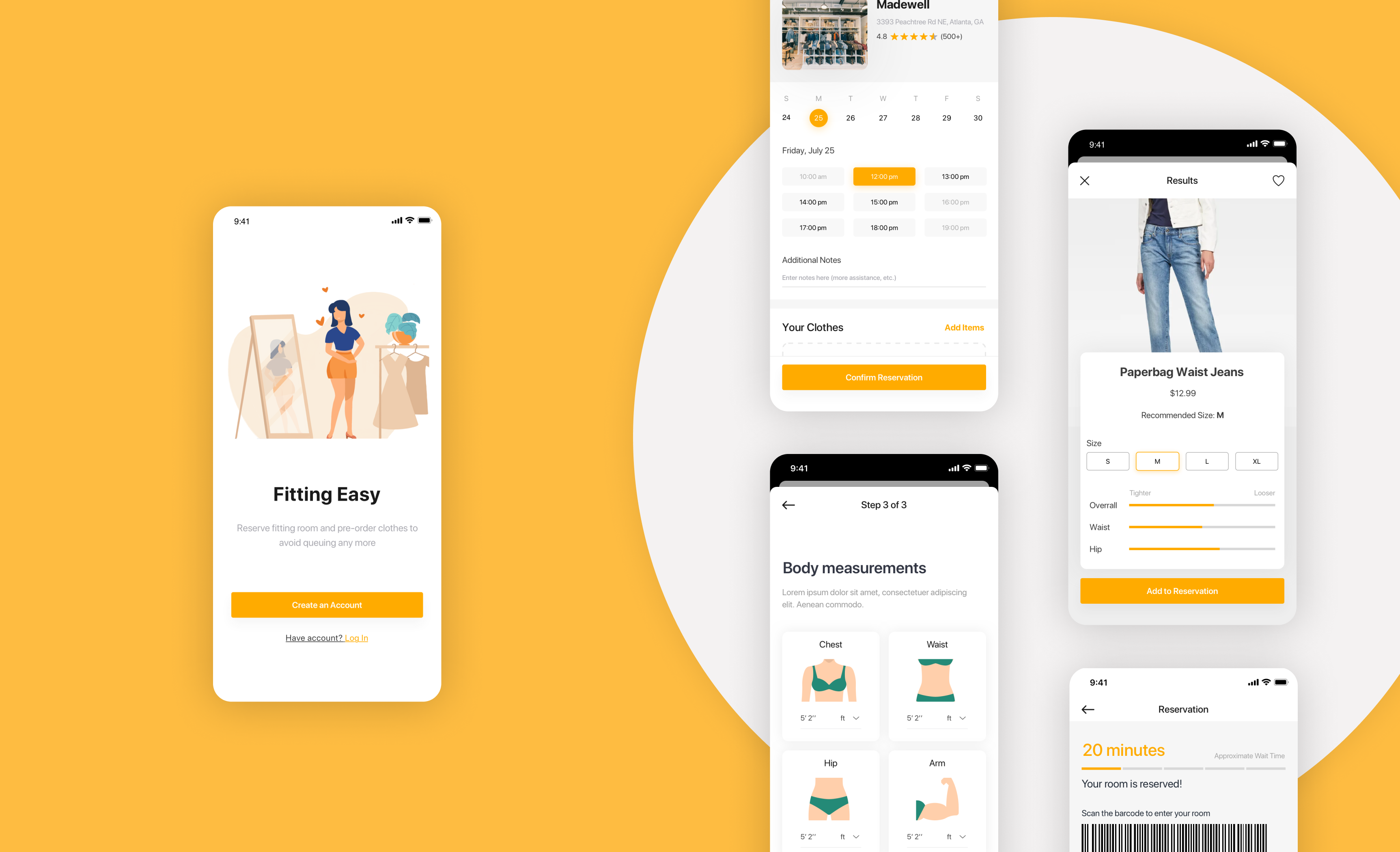
Users can reserve fitting rooms in advance to reduce the waiting time. And they can block enough time as needed to try on clothes so don’t have to worry about someone waiting in line outside.
Pre-ordering clothes online and in-store to solve the problem that wheelchair users have trouble carrying items using wheelchairs while navigating through stores, also the issue with reachability to the clothes.
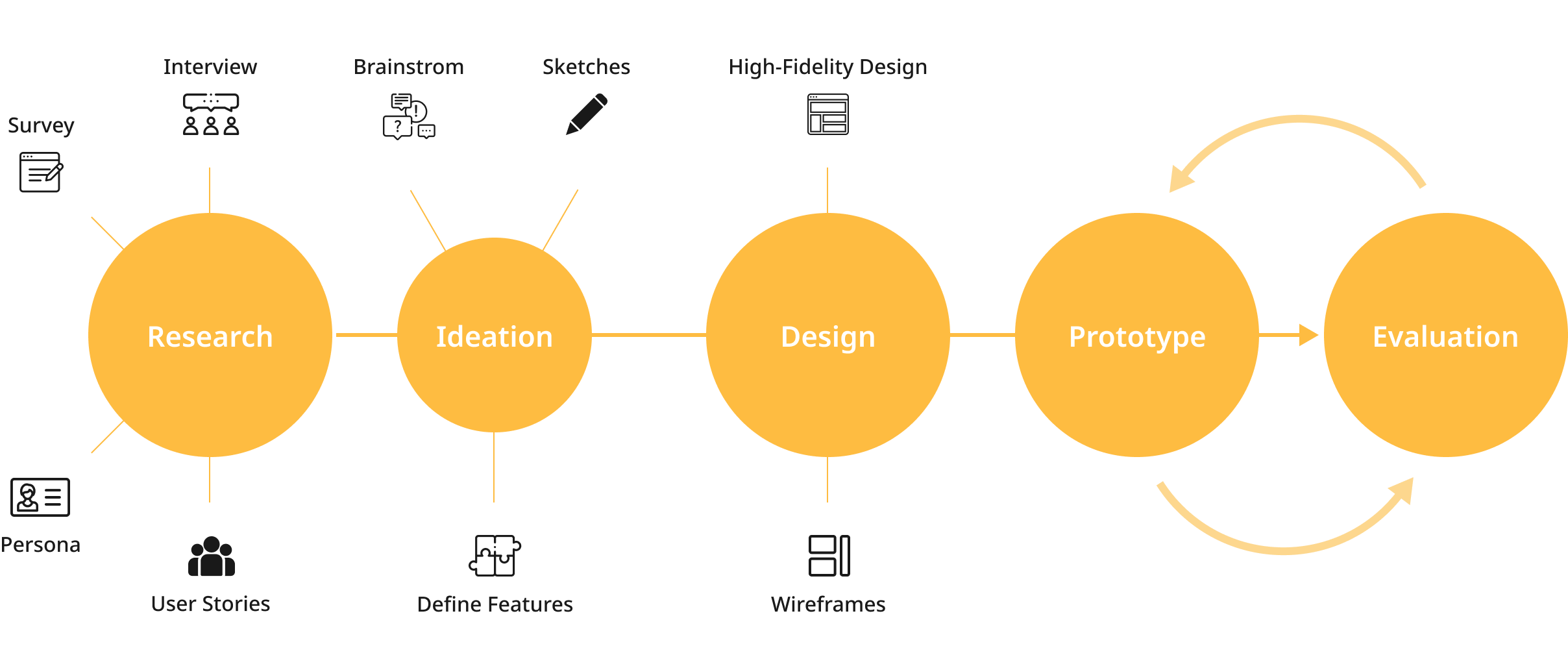
We started the project by understanding wheelchair users' current experiences of clothing shopping at physical stores. To answer the following questions:
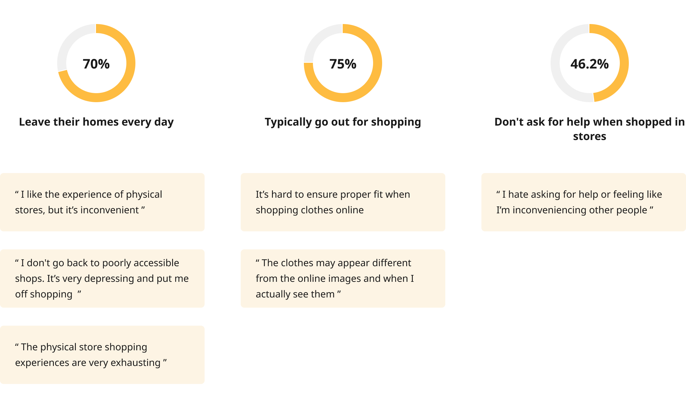
We launched an online survey with questions about current shopping behaviors, experiences, and opinions. We distributed our survey online through forums, Facebook groups, Craigslist, and Reddit. We received 27 respondents.
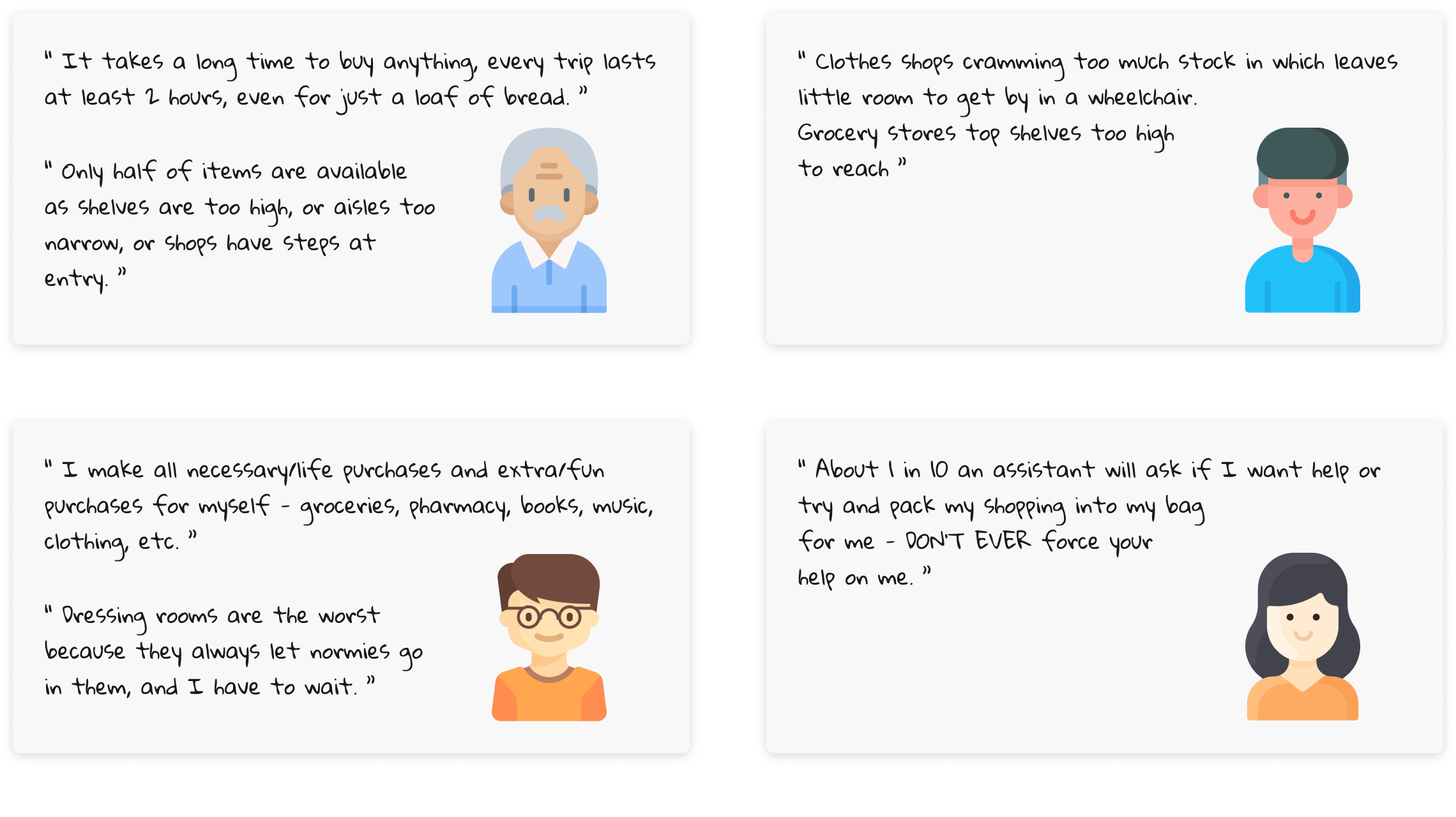
We Interviewed 4 participants including two wheelchair users, an occupational therapist, and a research scientist who specializes inaccessibility.
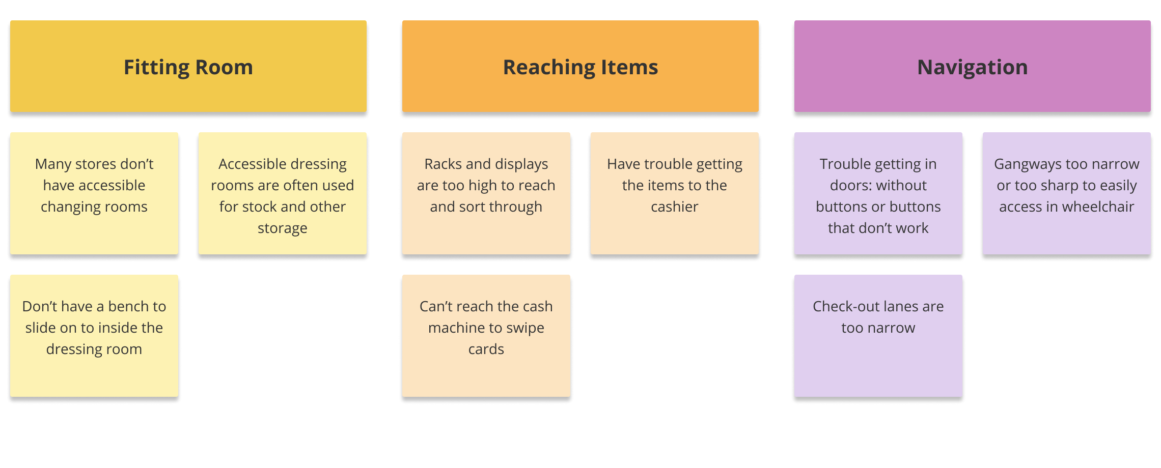
From our survey and interviews, we created an affinity map as a group tp identify three major problems wheelchair users face when shopping in a physical store.
To better guide our design and enable everyone on the team to empathize with our users, I came up with the following personas:
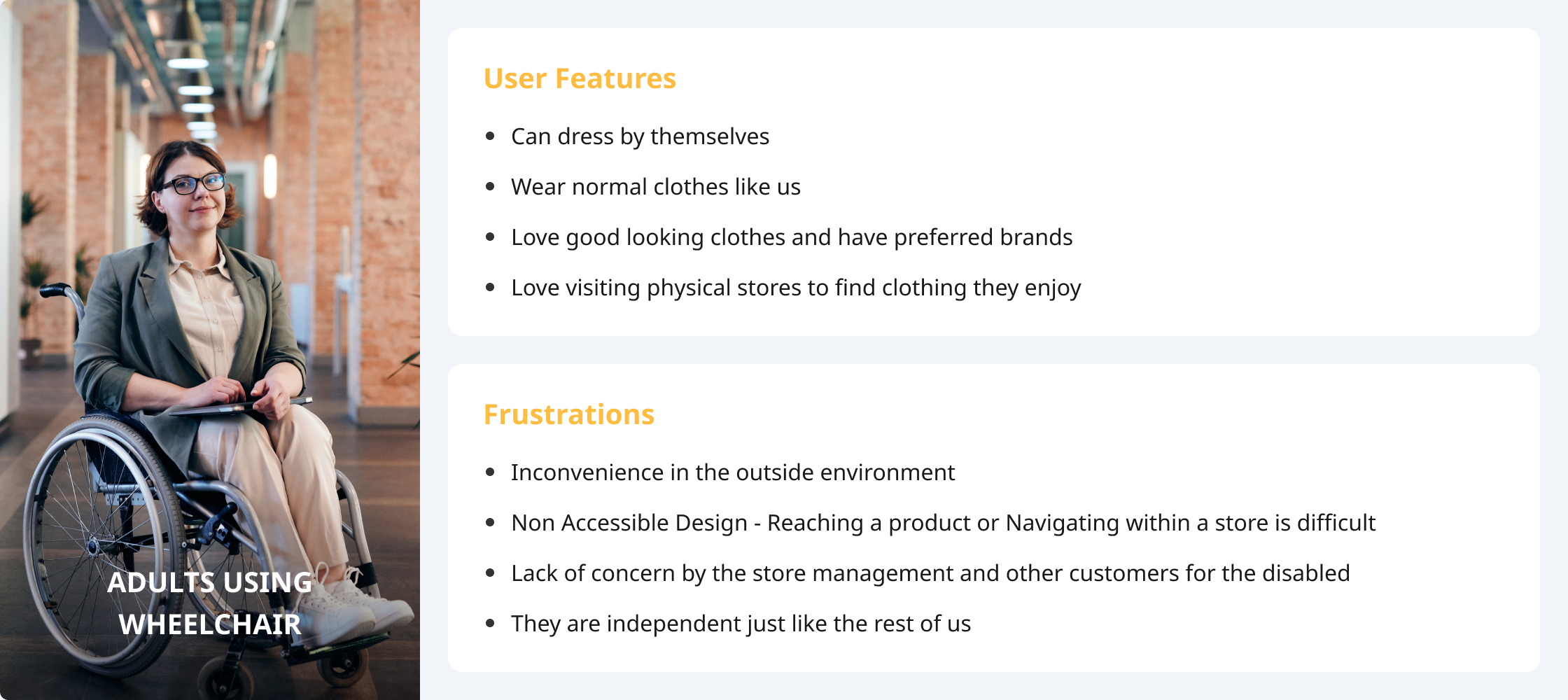
Our key users are adults across a wide range of ages who are not able to stand or walk, and who use wheelchairs in their daily lives. They are strong-willed, independent, and go about doing their daily tasks, activities, and responsibilities.
Based on our understanding of wheelchair users’ shopping experience, our team worked on brainstorming multiple design ideas to explore the potential design space, to push the boundaries of design possibilities. After two rounds of brainstorm sessions, we generated more than 30 ideas.
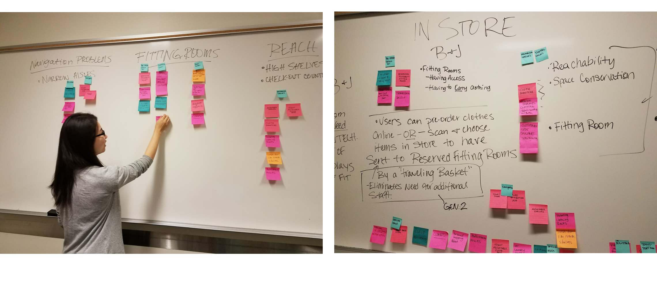
We then went through the ideas and considered feasibility, effectiveness, cost, and creativity. Eventually, we settled on the following core functionalities:
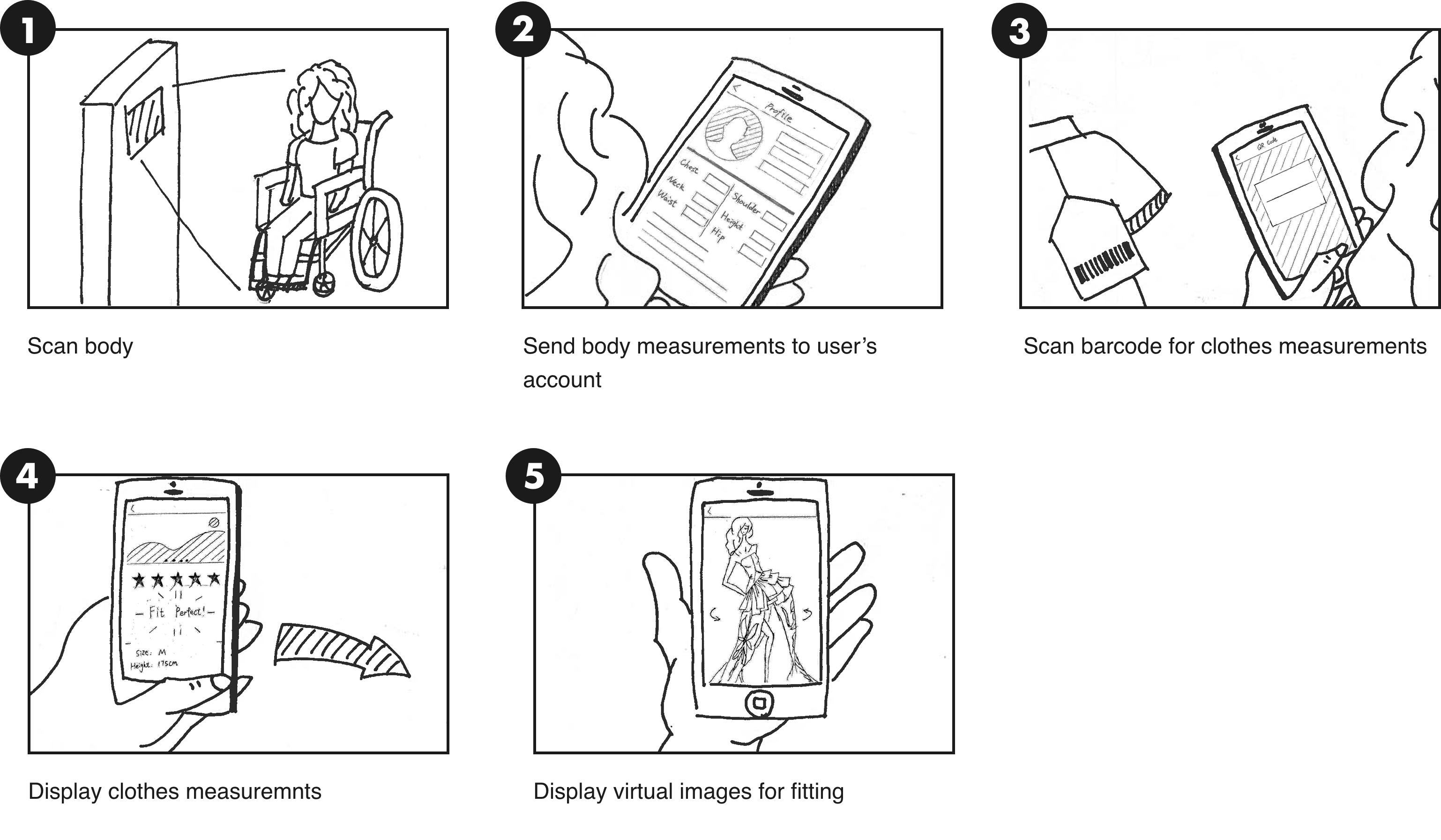
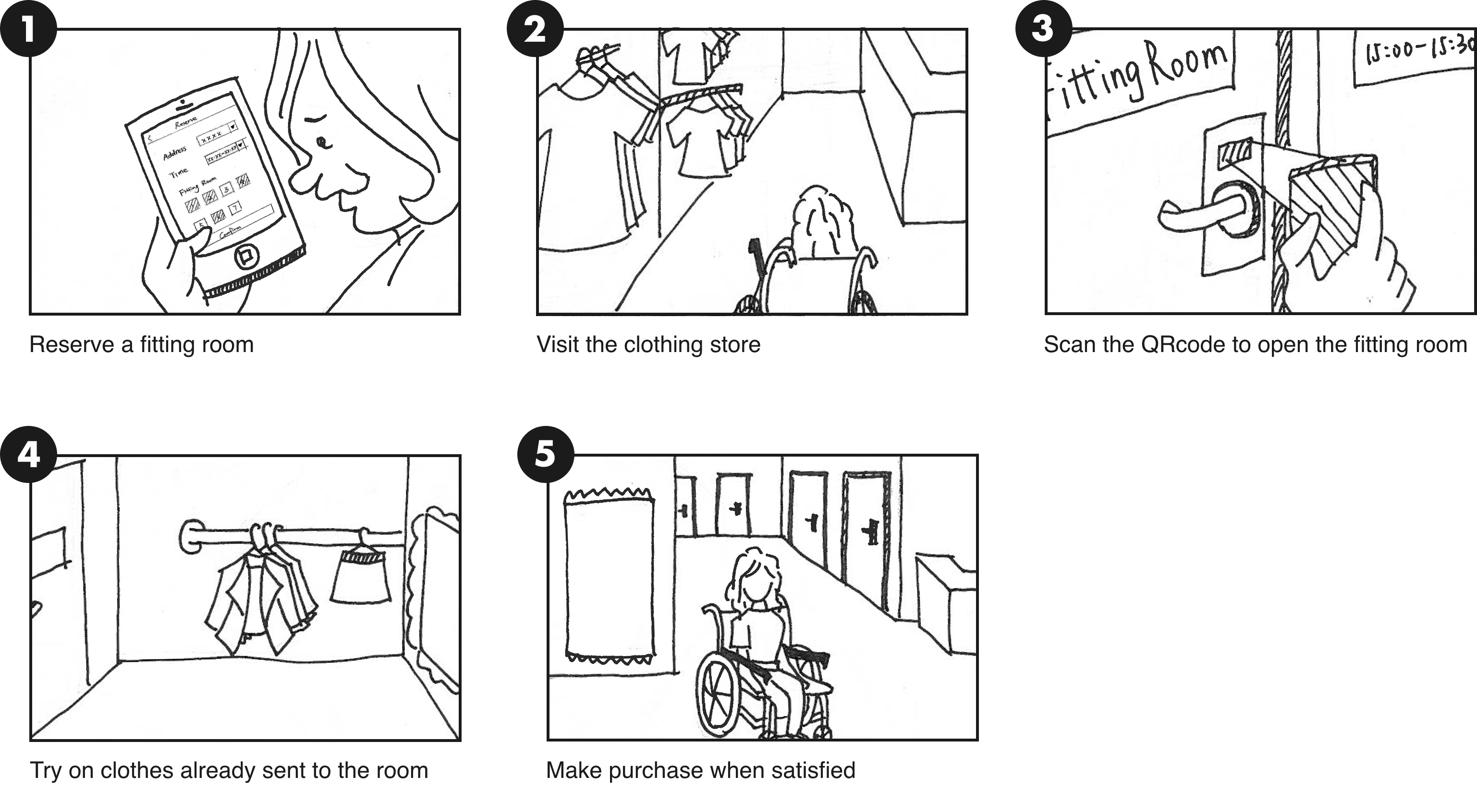
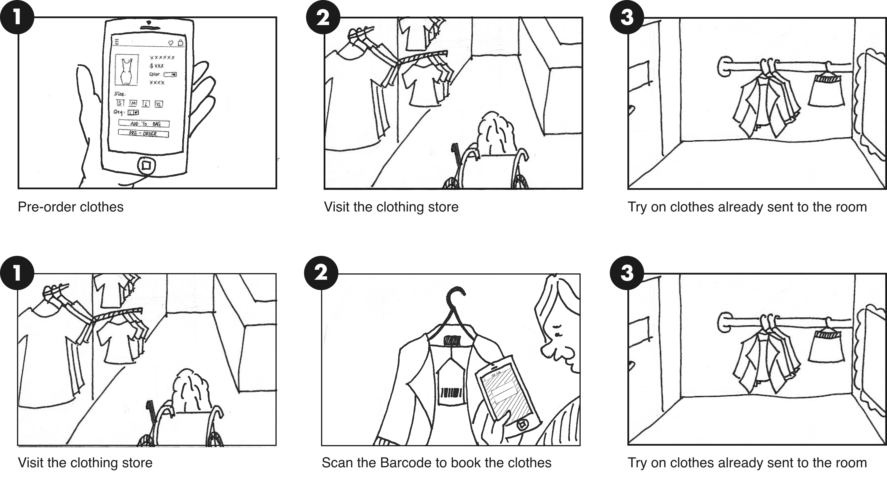
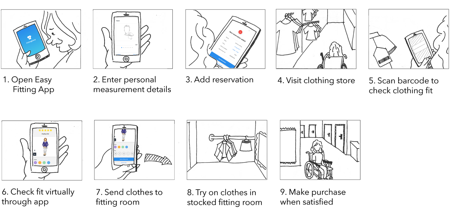
After we finished the paper sketch and storyboards for our design concepts, we launched a survey and interviewed experts to gather user feedback. We got many valuable insights and reconsidered on how we could better design our final solution.
The idea to have a body scanner was dropped with concerns over privacy. Since the owner organizations of the devices would have access to users' body measurements, a lot of responses from our survey had highlight privacy concerns. And our users would not like having been captured through a camera in a fitting room.
Another challenge of a body scanner was the accuracy of the device. The technology already exists, but it is not accurate enough. Considering the number of such devices that are needed to be stationed at the store and their cost, this idea could be taken into account in another 5-10 years.
Instead of a body scanner, we ask users to enter their body measurements through the application, so the data could stay in users' phones. And we will evaluate the fittingness based on the body measurements, which will be more accurate.
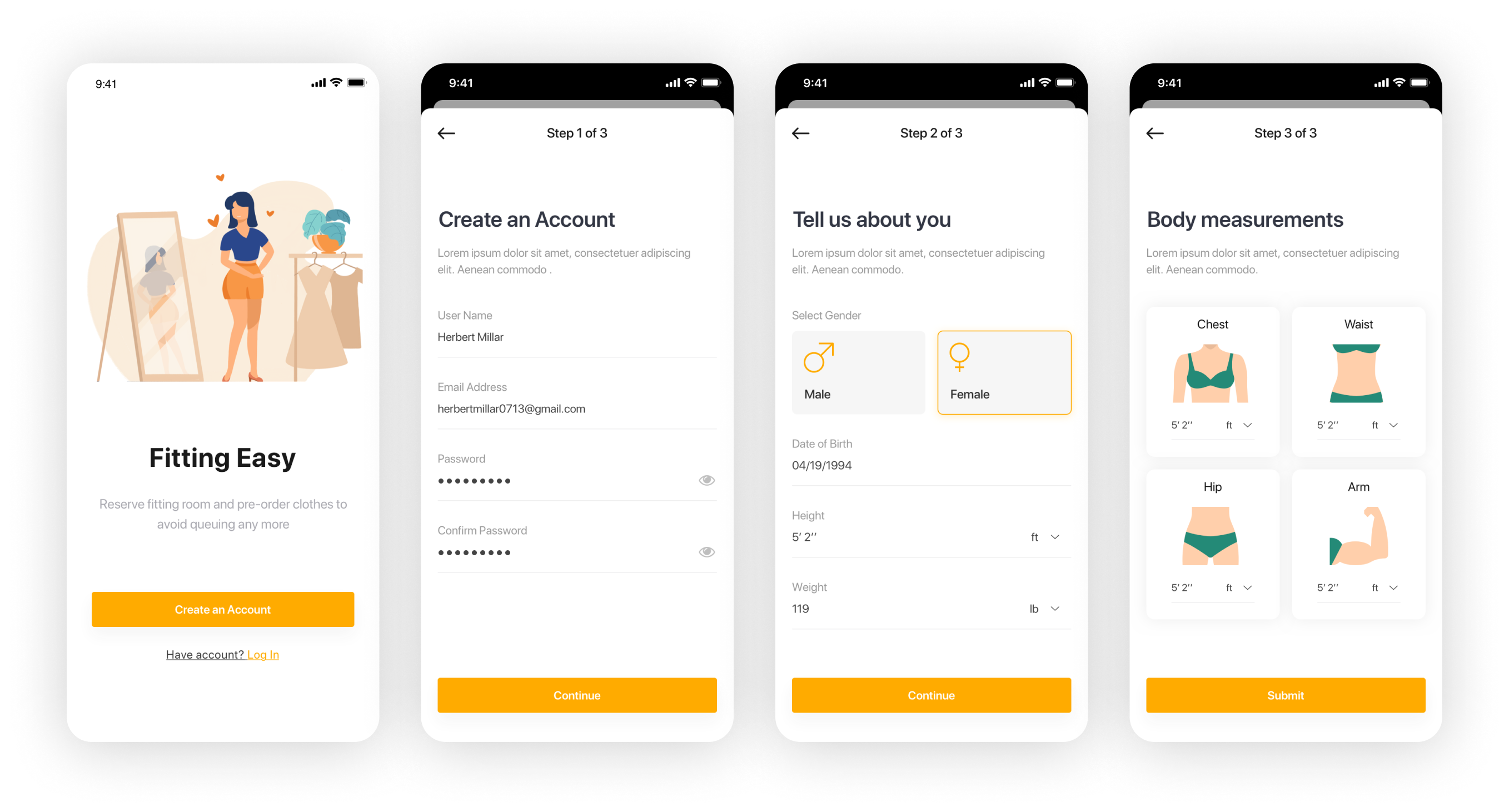
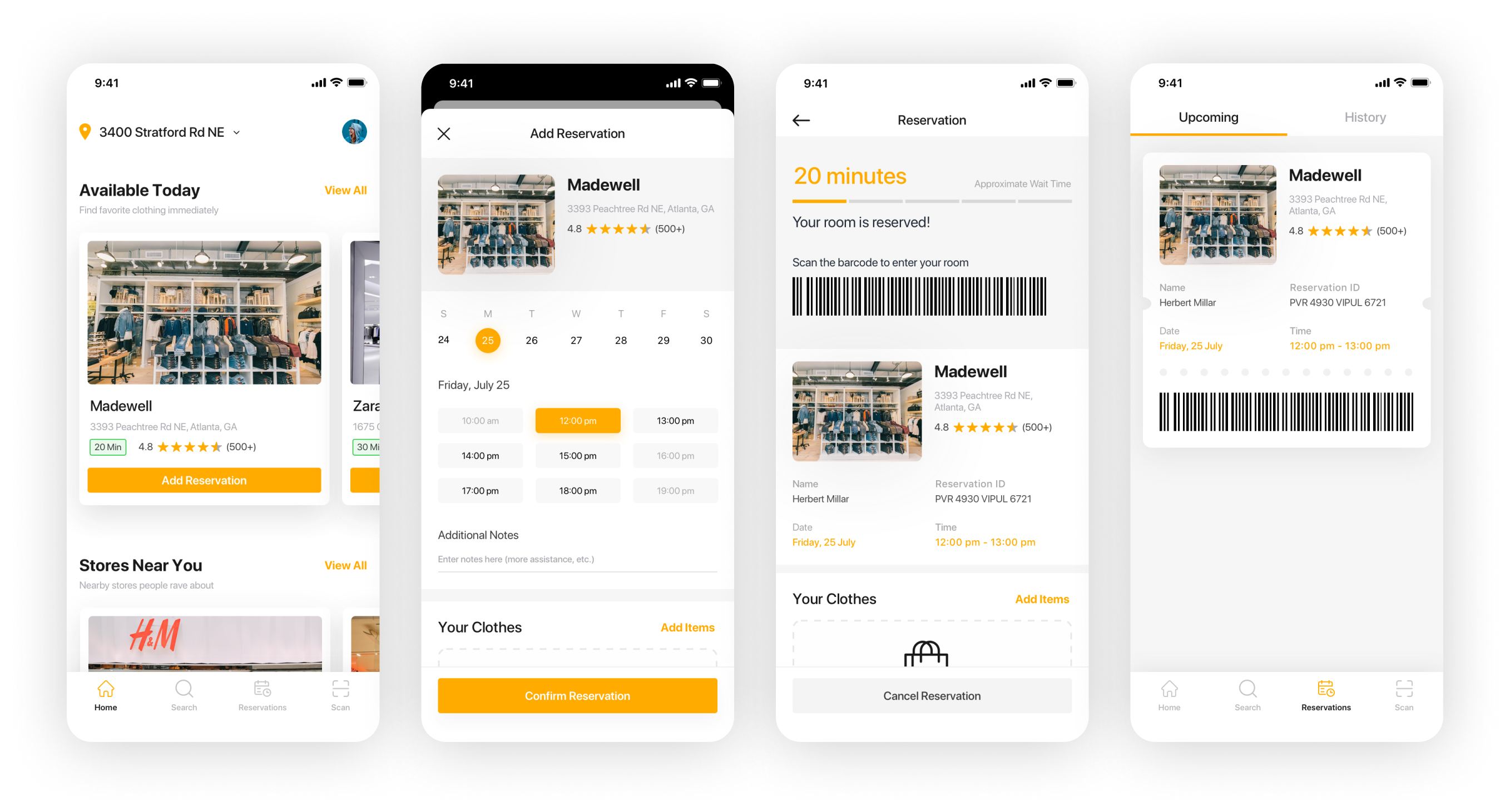
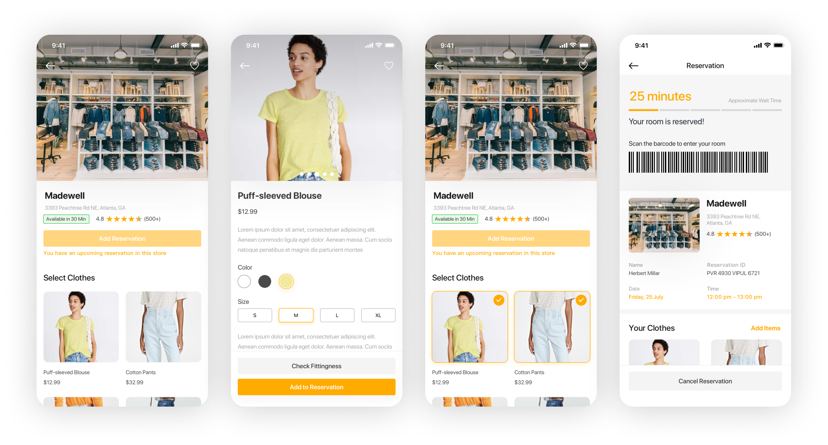
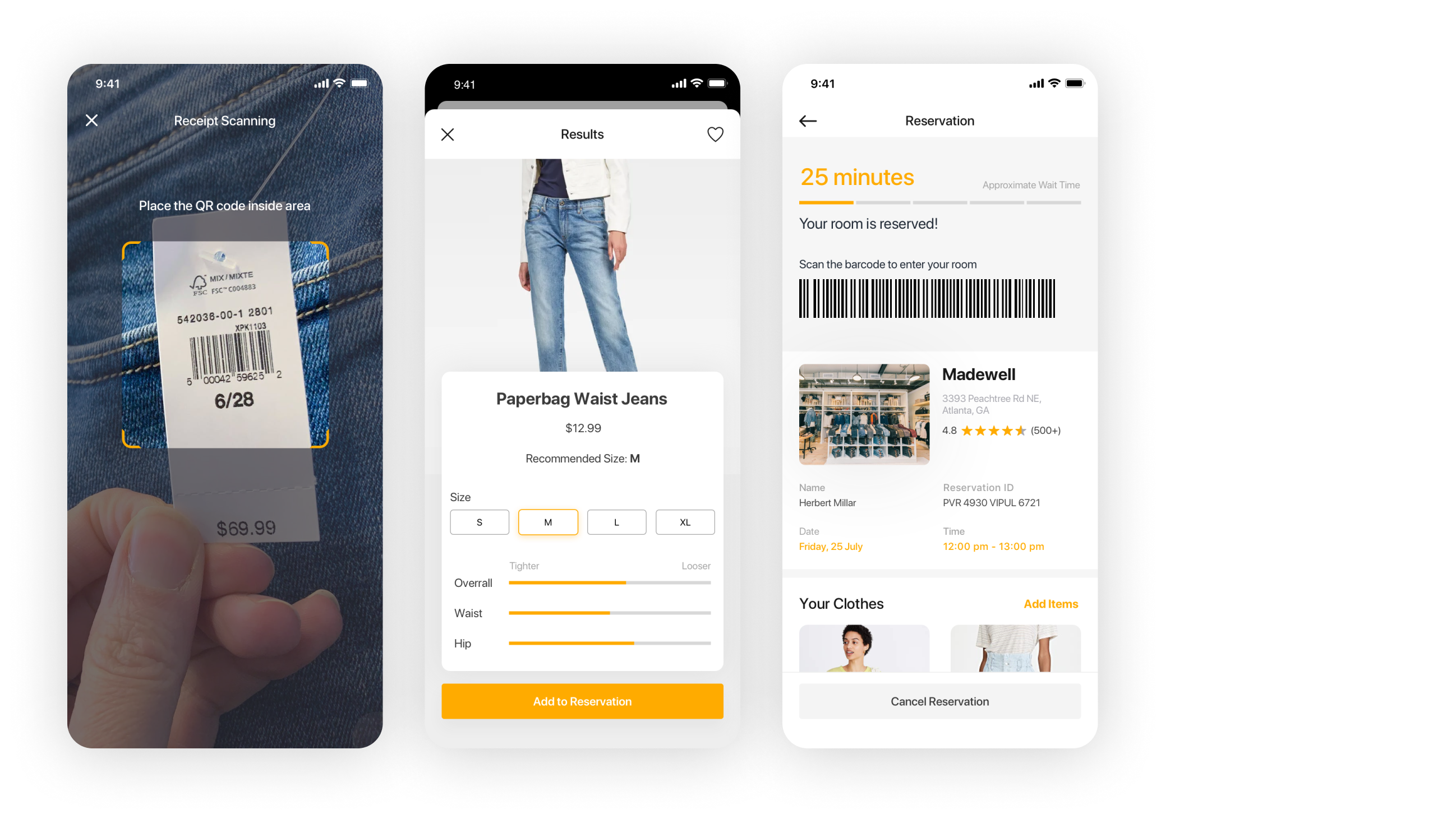
5 users helped us perform usability testing. As they performed tasks, we asked them to think aloud. Once the users completed their tasks, we asked several follow-up questions. Then they rated our design through the questionnaire based on SUS. The SUS result is 84.375, indicating that users are very satisfied.

