Team: 3-member Team Project @ Sparks Grove Internship
Duration: Jun 2017 - Aug 2017 (8 Weeks)
Tools & Methods: Sketch, InVision, Survey Monkey, Agile
My Role: UX Design, UI Design, Usability Testing
The resort's website acts as a portal for site visitors to explore and browse all the resorts options within our client’s brand. Typical site visitors usually navigate the site without a pre-determined destination. So how can we use design to engage users in the luxury vacation experiences, and ultimately convert ‘lookers’ to ‘bookers’?
The project scope includes redesigning the landing page of the desktop website, and launching a responsive mobile website that wasn't existing.
I was the sole designer on the team alongside 1 product manager intern and 1 UX researcher intern. I was responsible for the UX/UI design for the project. Whilst the internship was short, some key achievements listed below:
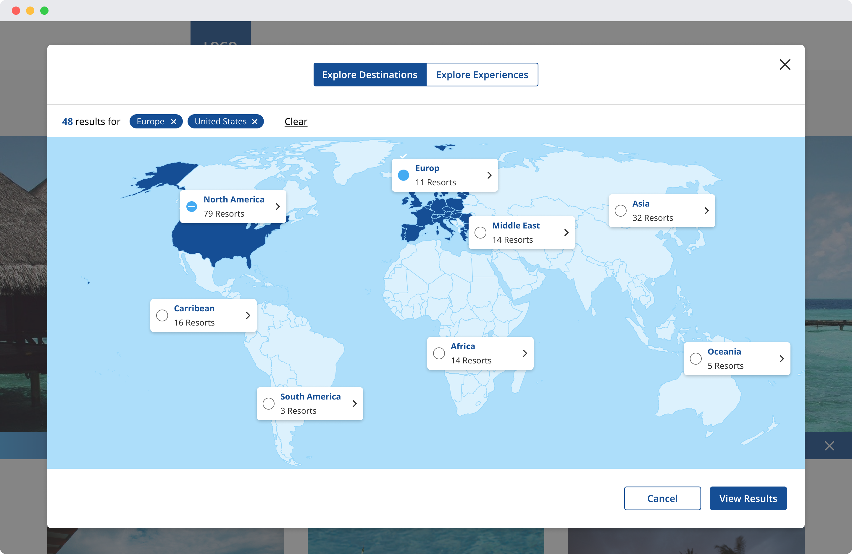
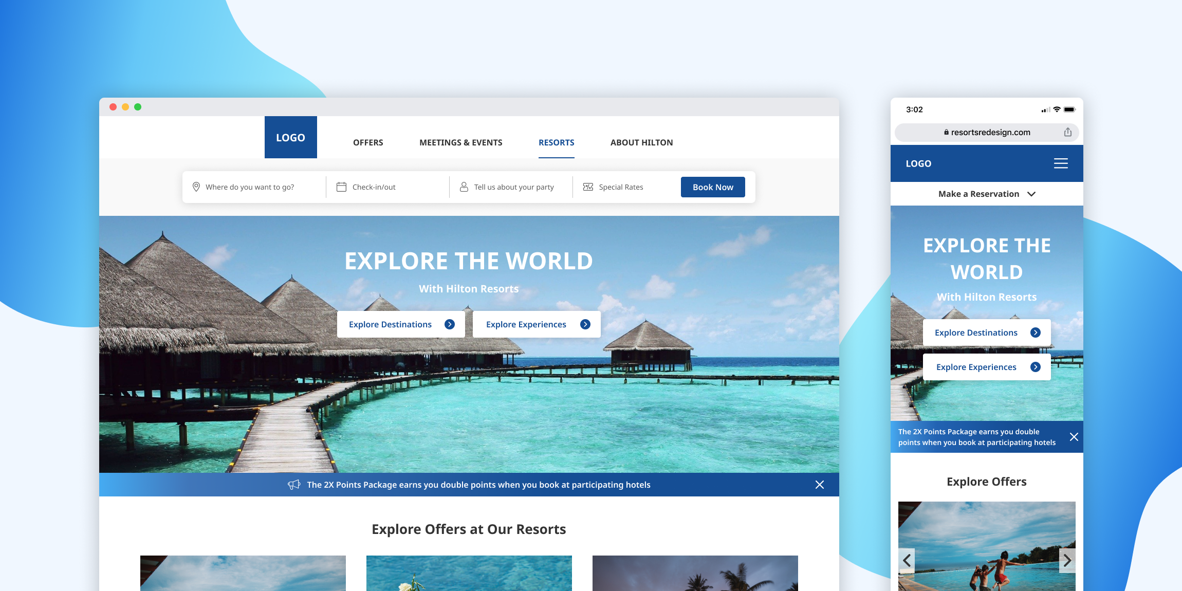
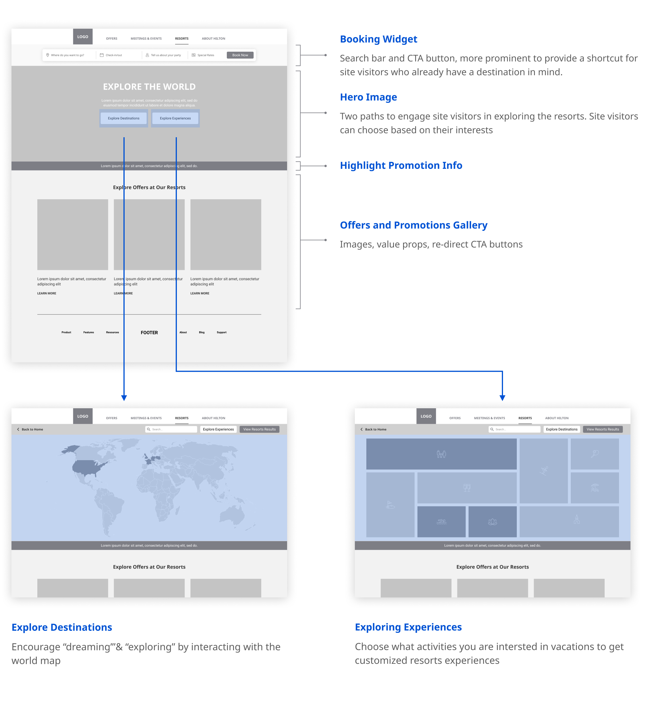
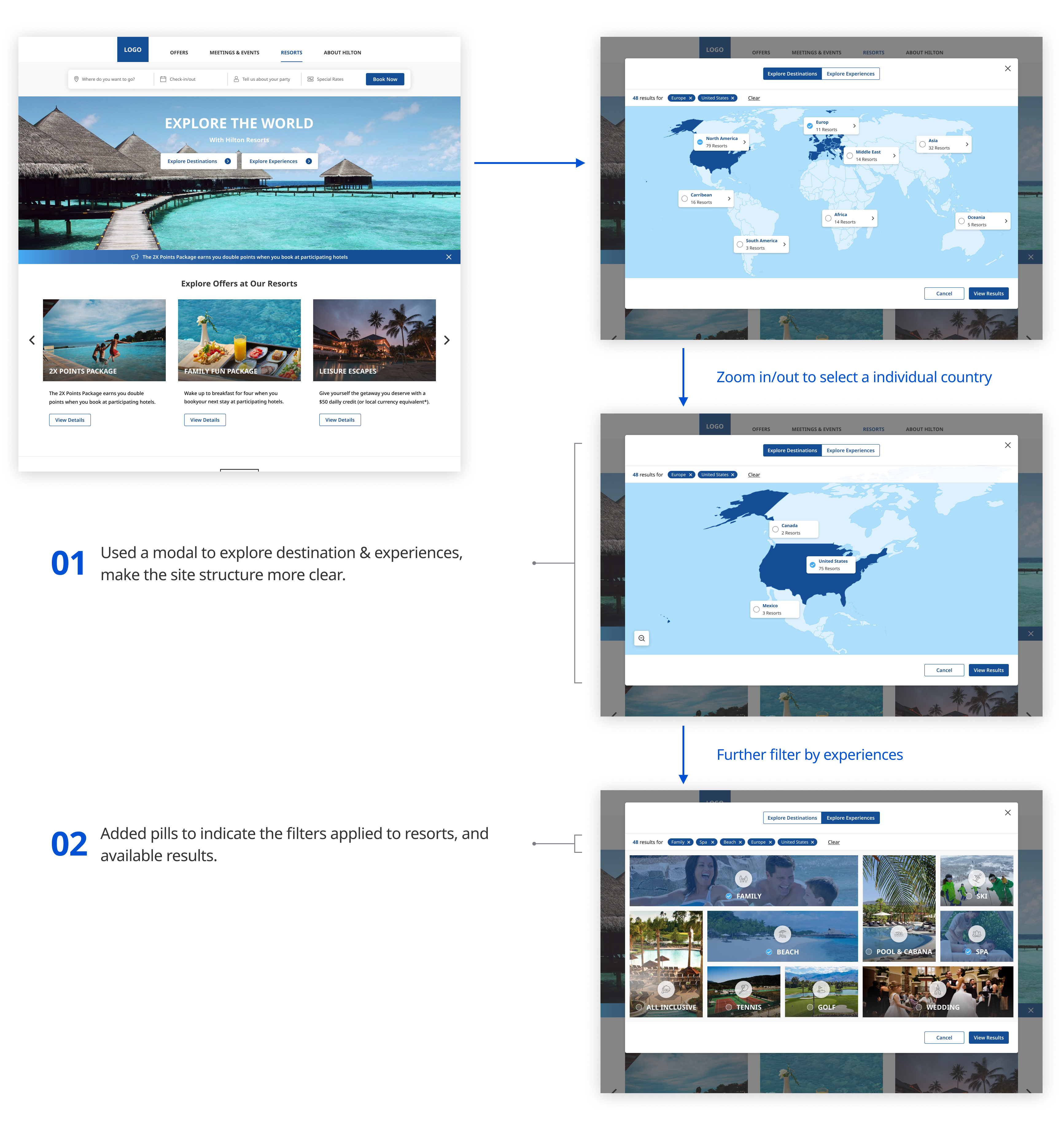
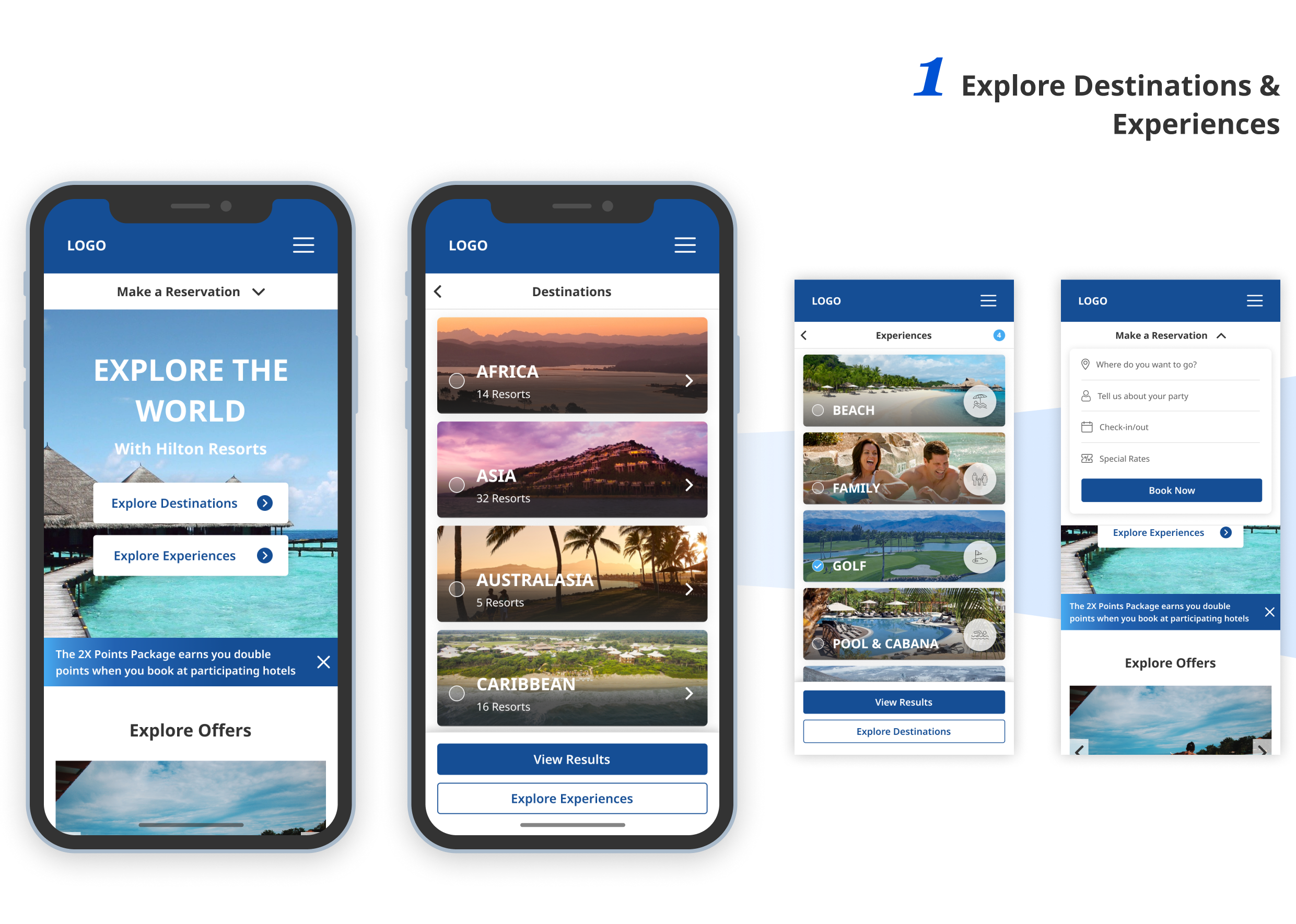
Click on the interactive map to select the destinations that you are interested in. Using the world map to encourage site visitors exploring and dreaming the vacation experiences.
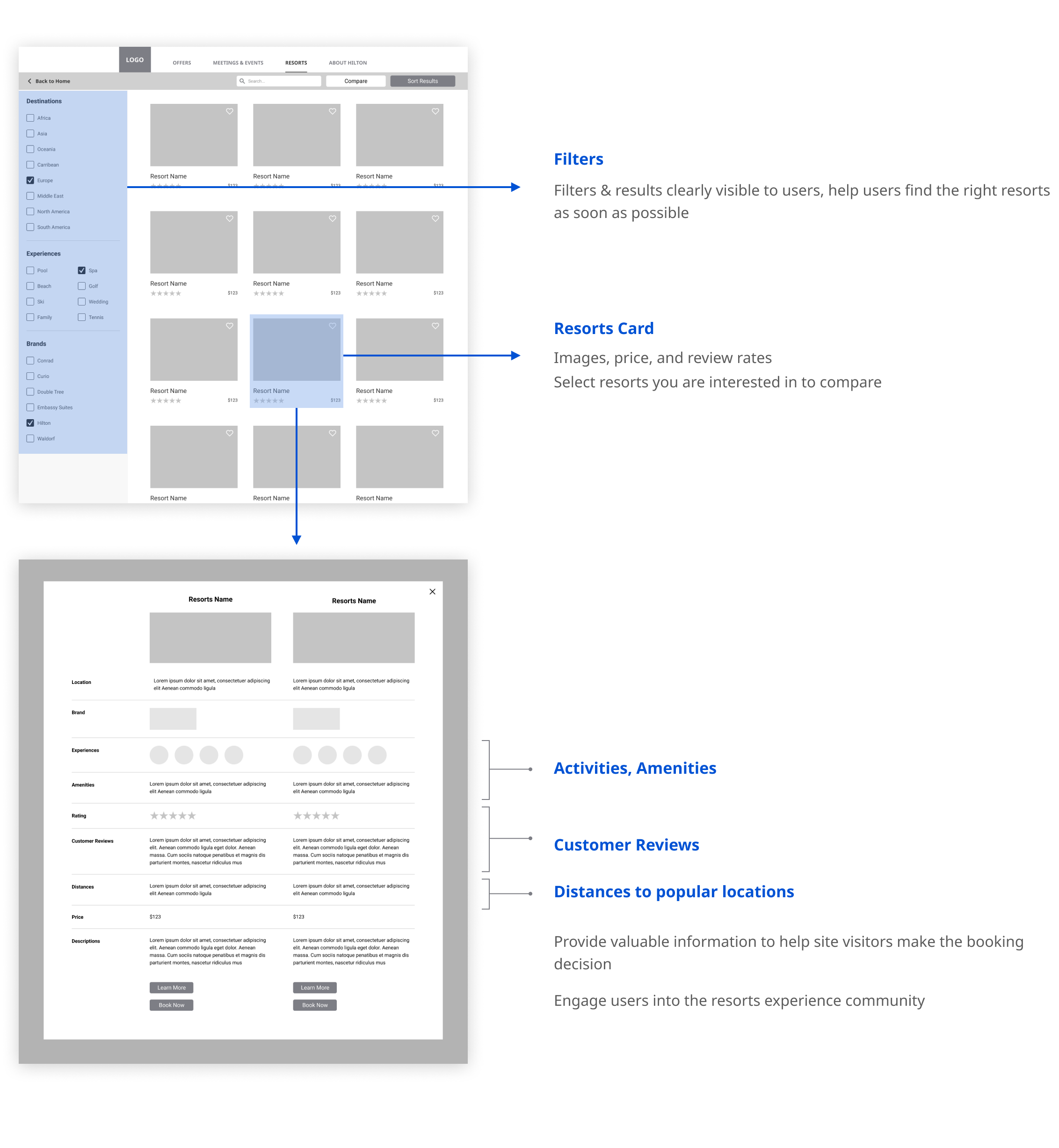
The image gallery provides a visually pleasing way to filter down the resorts you are interested in. Utilize imagery to create an "inviting feel" for site visitors.

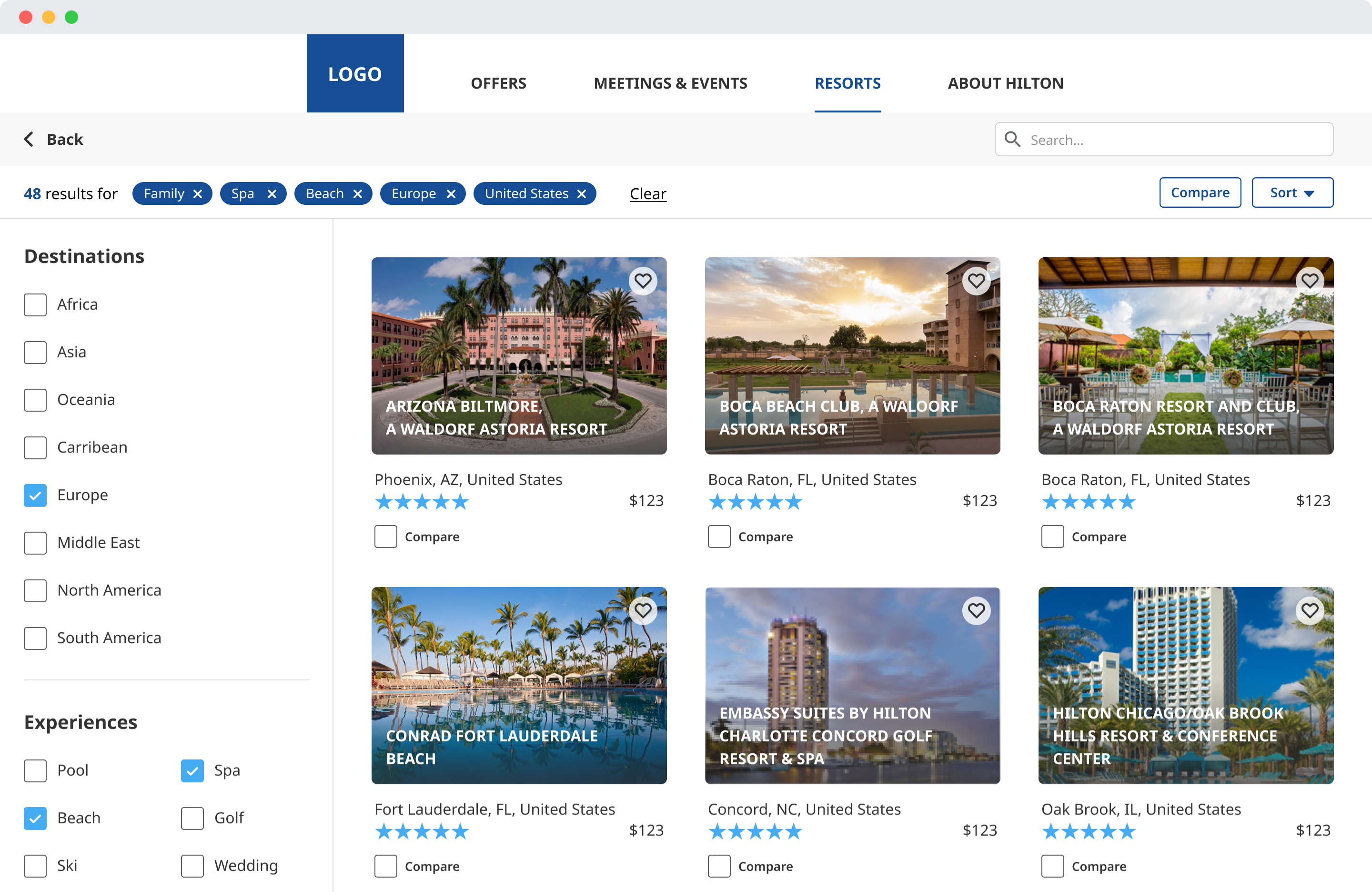
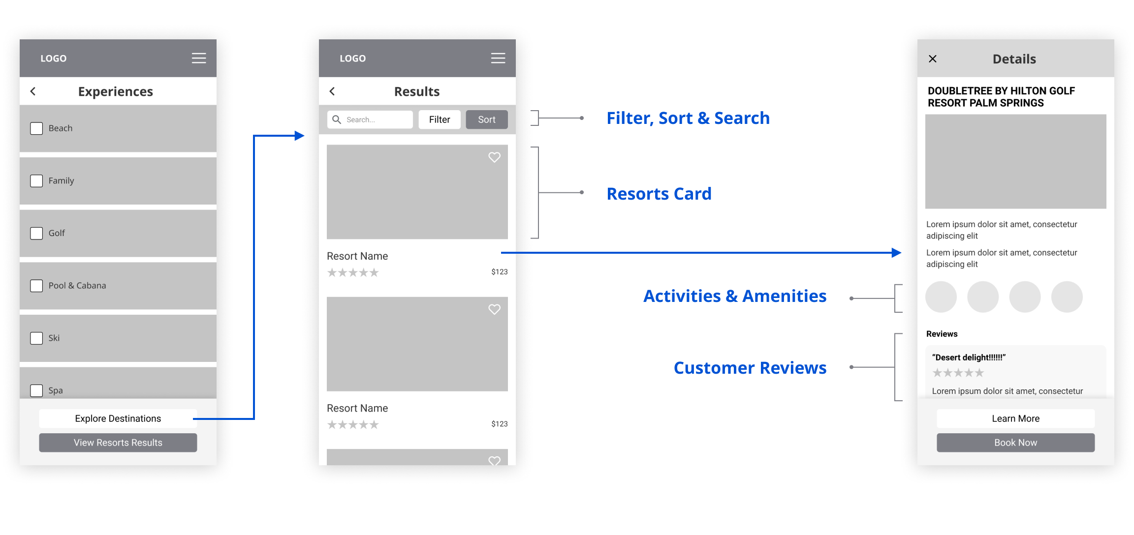
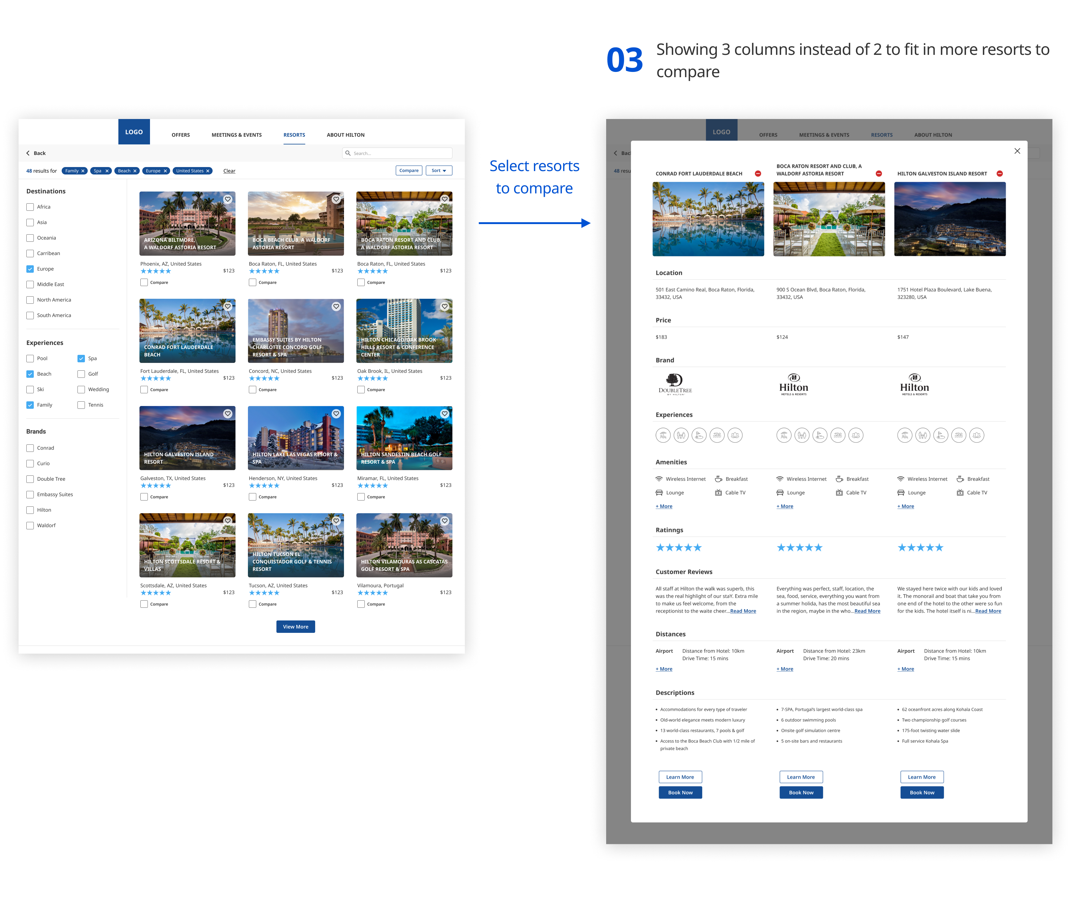
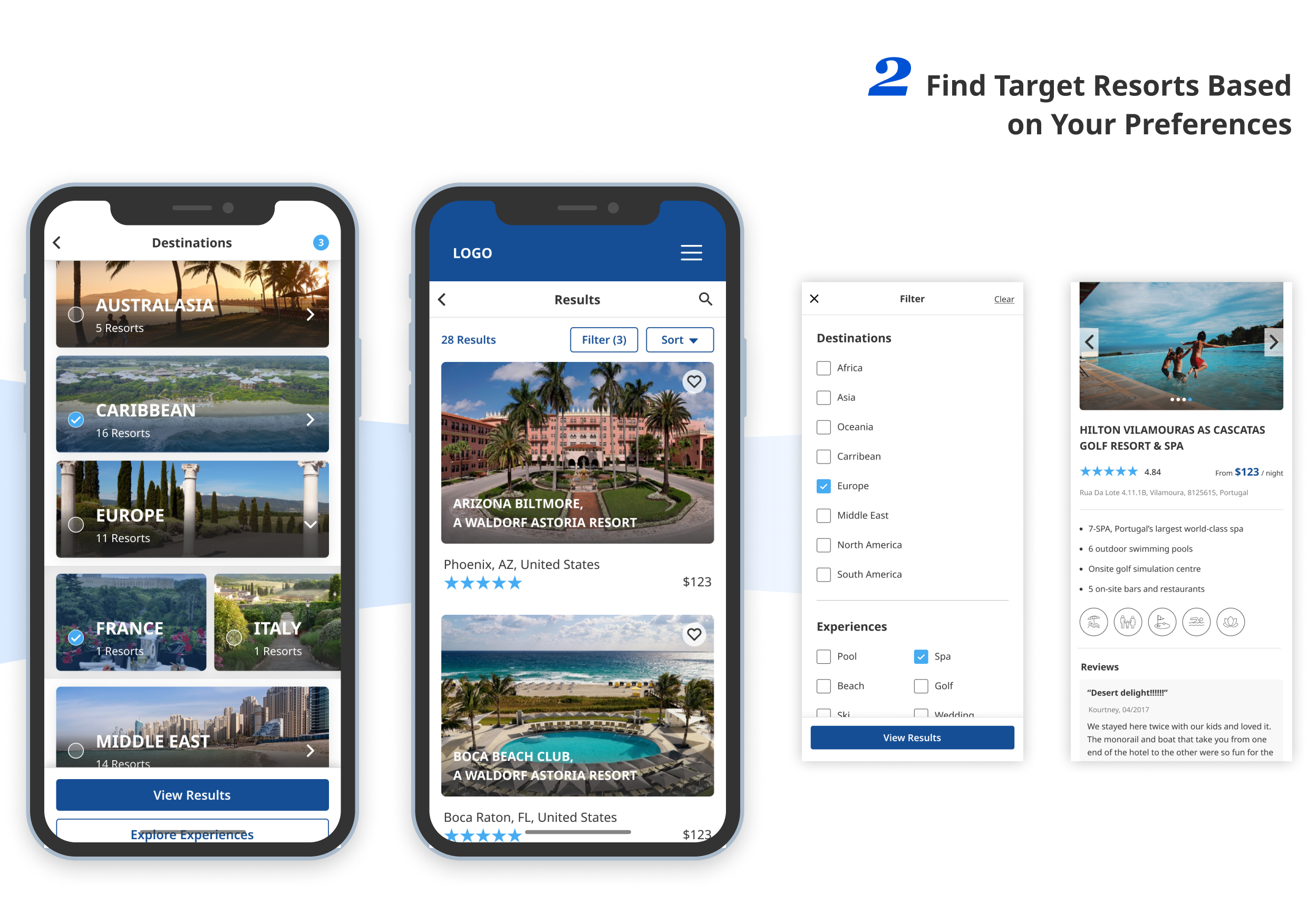
Added the advanced filter feature to make the site more functional and practical. Easier to find and book the perfect resort vacation.
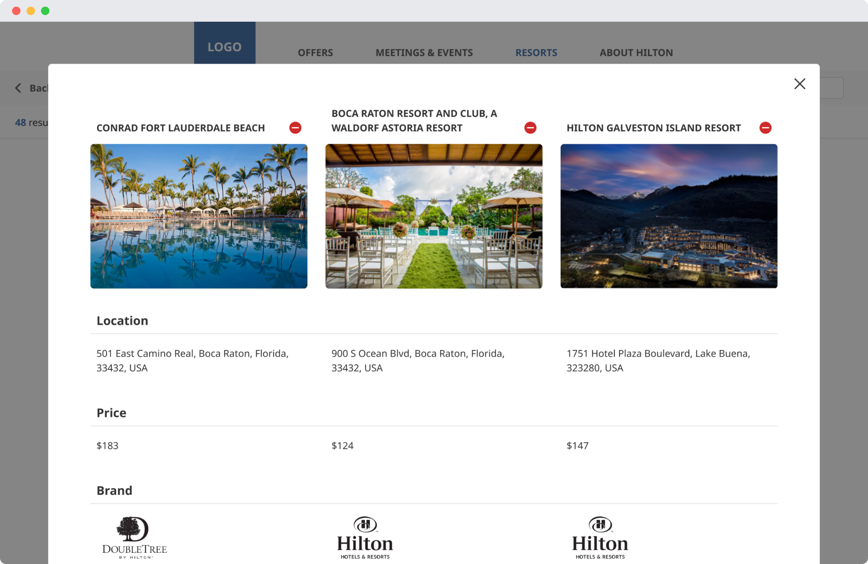
Make the path to purchase easier by adding the comparison tool and help site visitors to make the decision. Ratings and reviews help site visitors to get a sense of "real people" with "real experiences" at the resorts.
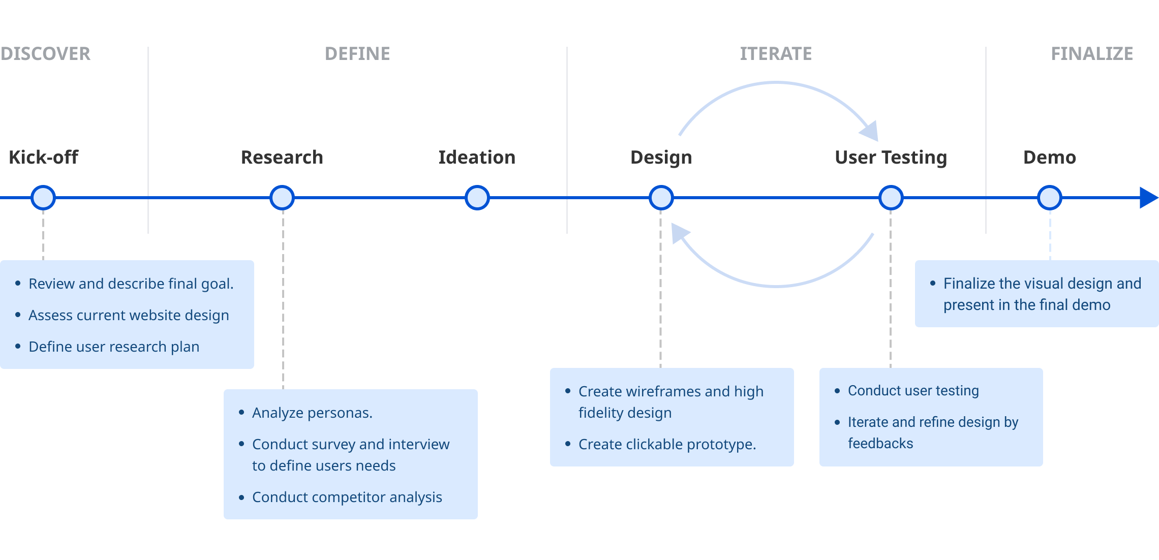
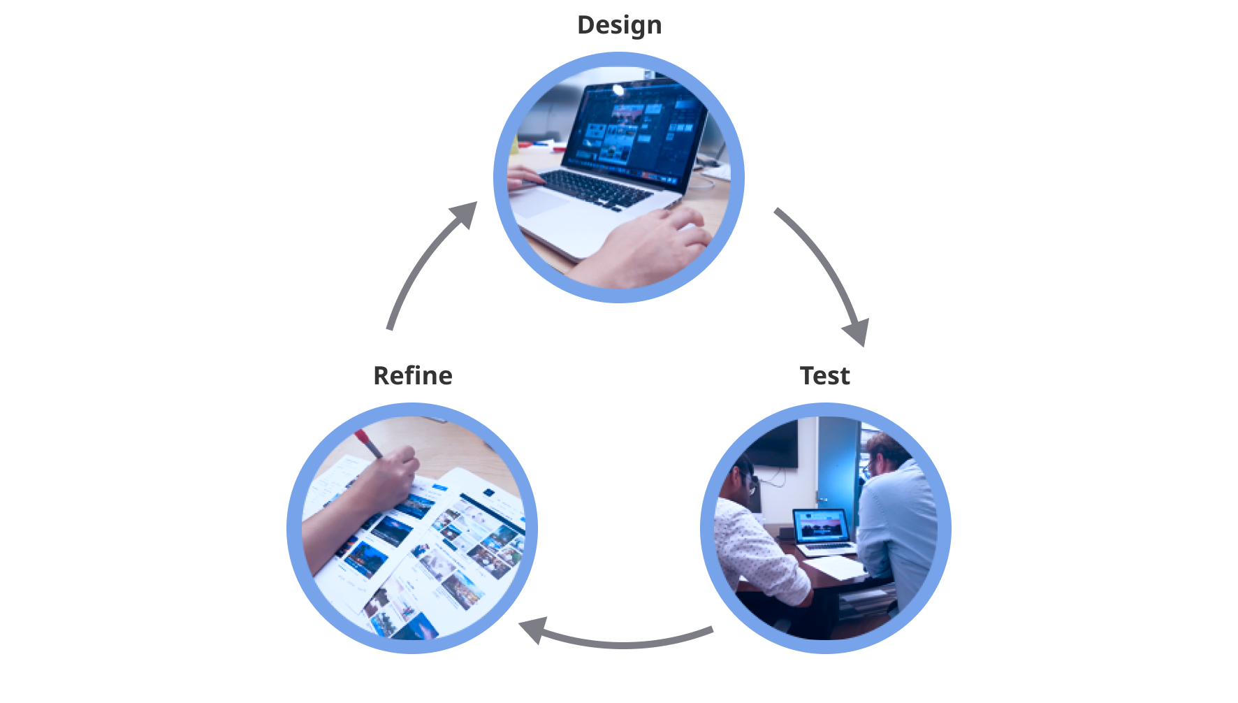
We utilized Agile methodology with several iterations to refine our deliverables. The team meets daily for morning stand-ups to discuss the tasks needed to be done on that day. At the end of each week, we presented our clients with a Demo of what we’ve been working on, ask for our client’s feedback, and discuss what we plan to do for the following week.
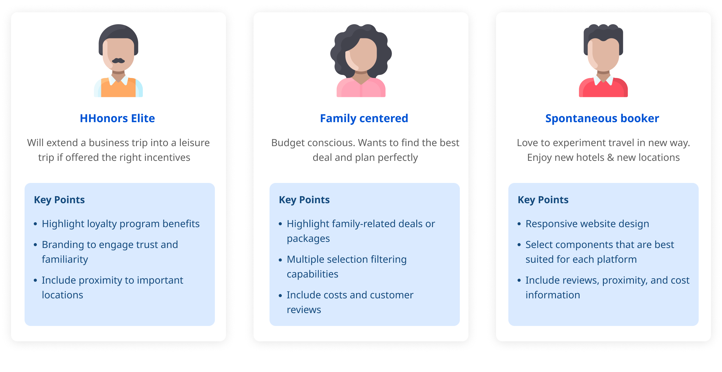
Every design targets at an audience. The first thing we did after given the task is to specify the users we should design for and to know them and their goals.
Based on the given project brief, we summarized 3 personas to guide us in the design of our resorts website.
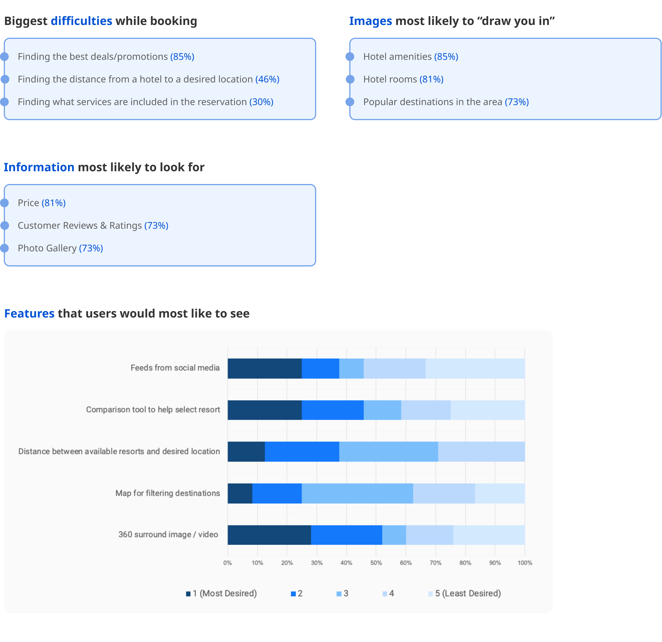
To understand more about the difficulties faced and types of information people look for on a resort's website, we sent out a survey internally to our coworkers. From the 26 responses we received, we drew important information to help us prioritize the content and features to be shown on our website.
For a better understanding of the current landscape, we conducted a digital assessment of our client’s website based on the following criteria:
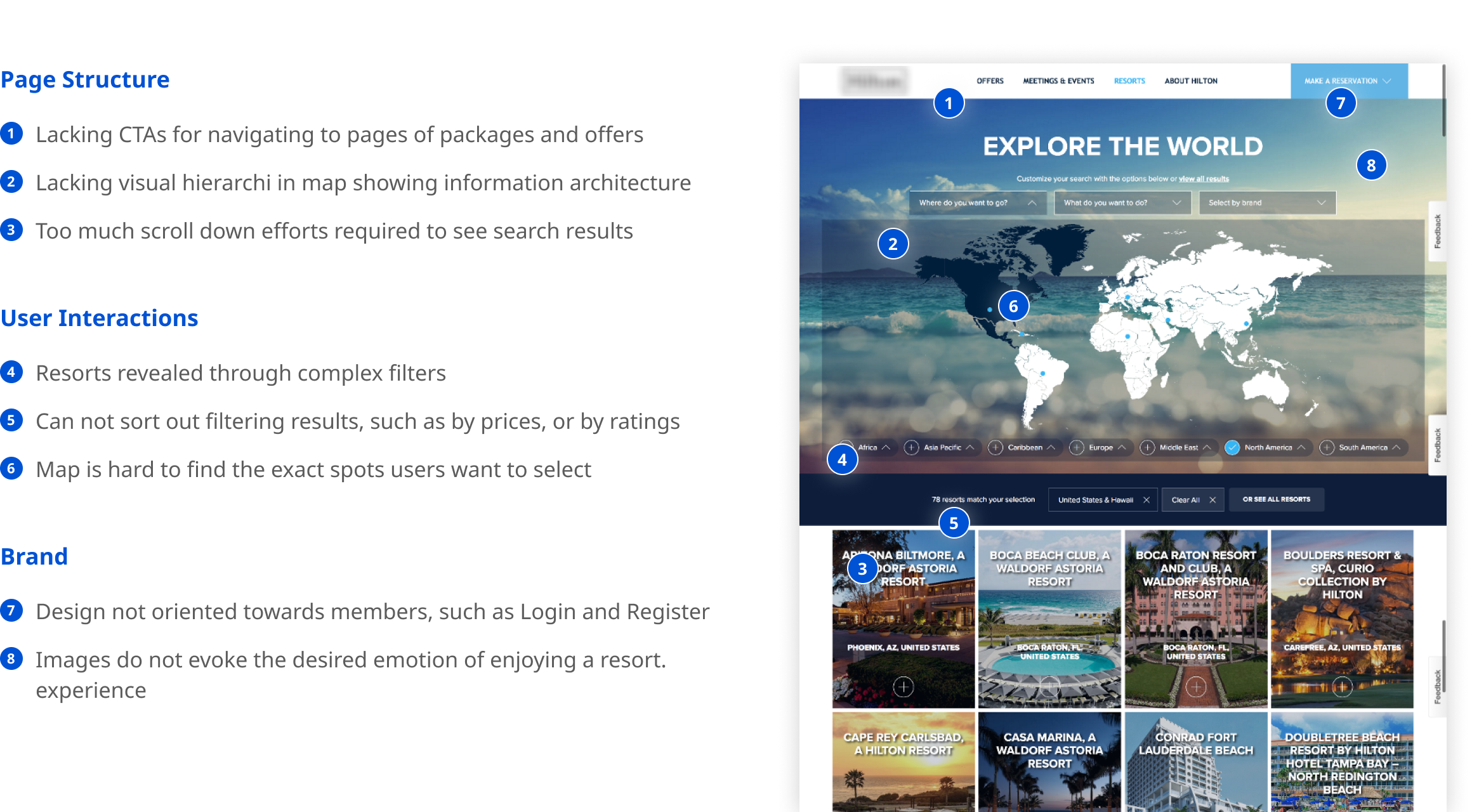
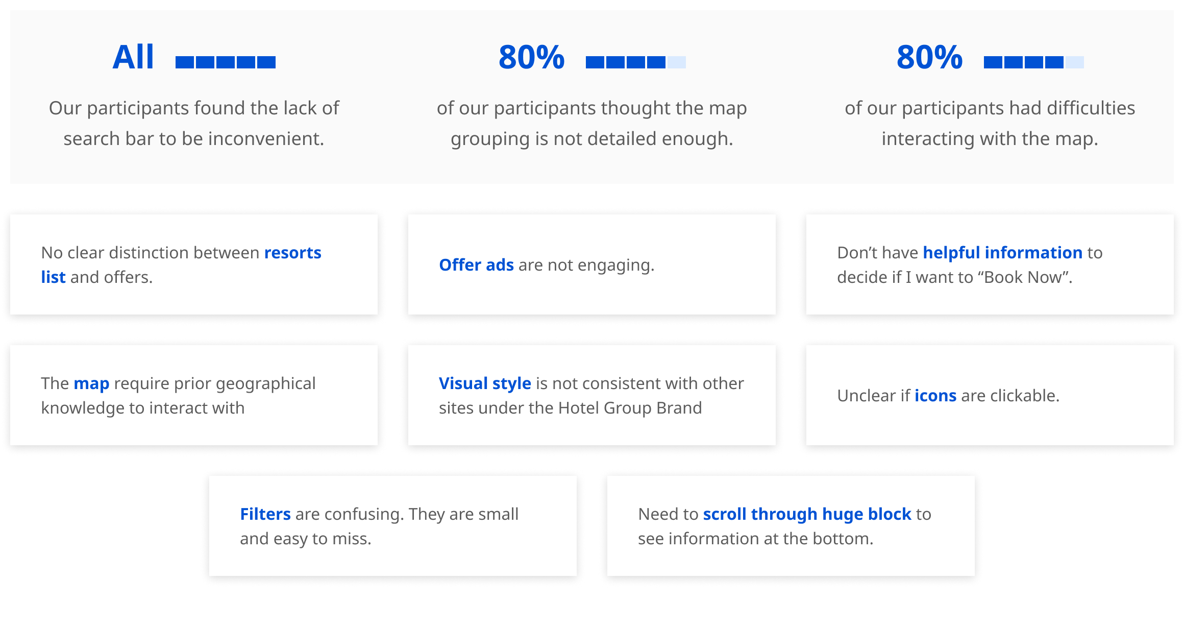
To further analyze the usability and functionality of the current website, we conducted 5 testing sessions to identify problems and gain data on what our participants like and would like to see on the website
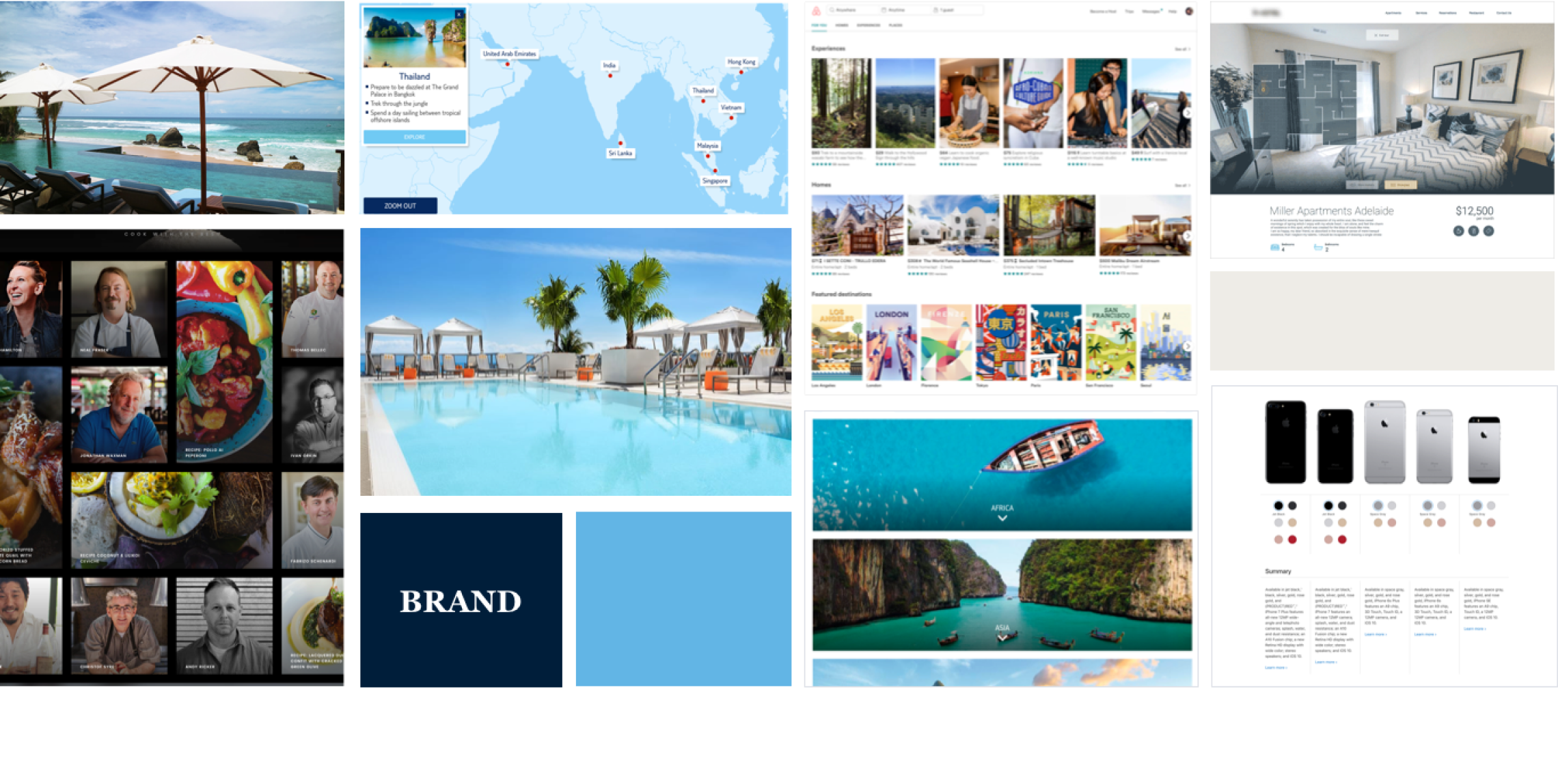
We utilized the same criteria to assess a few other competitor sites to analyze areas in which other websites are doing well and potential features that we could include. We also researched current technological trends such as 360 images and user-generated content. Lastly, we created an inspiration board to help consolidate the findings from our assessments.
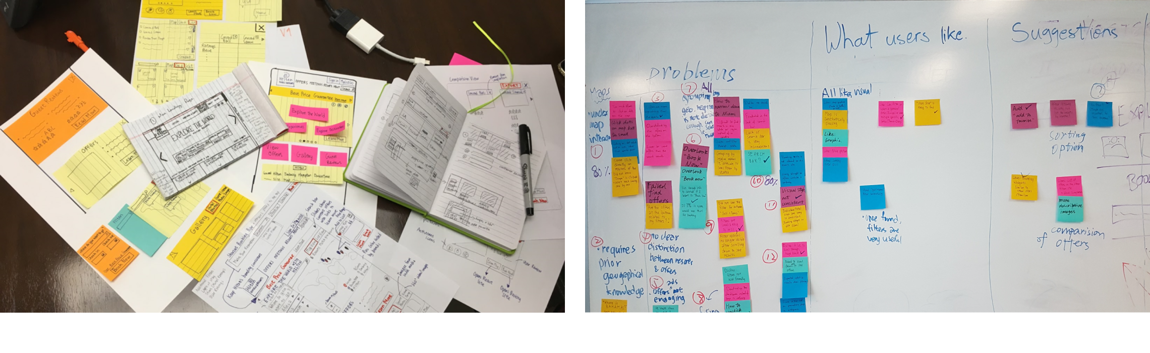
We created initial hand-drawn sketches for ideation based on insights from our user research and strategy.
We shared these design ideas with our supervisors and clients. We received great feedback on the design of filters and map navigation. They thought it was a great idea to inspire site visitors to explore resorts and experience, as well as help site visitors to drill down and find the resort meet their needs. They also loved the design idea of comparison tool and showcase customer reviews, because they inspire new customers and bring together the community.
In each iteration, we created the design, conducted user tests, and consulted with experts from the UX team, Creative team, and Strategy team. We then refined our deliverables according to the feedback we received.
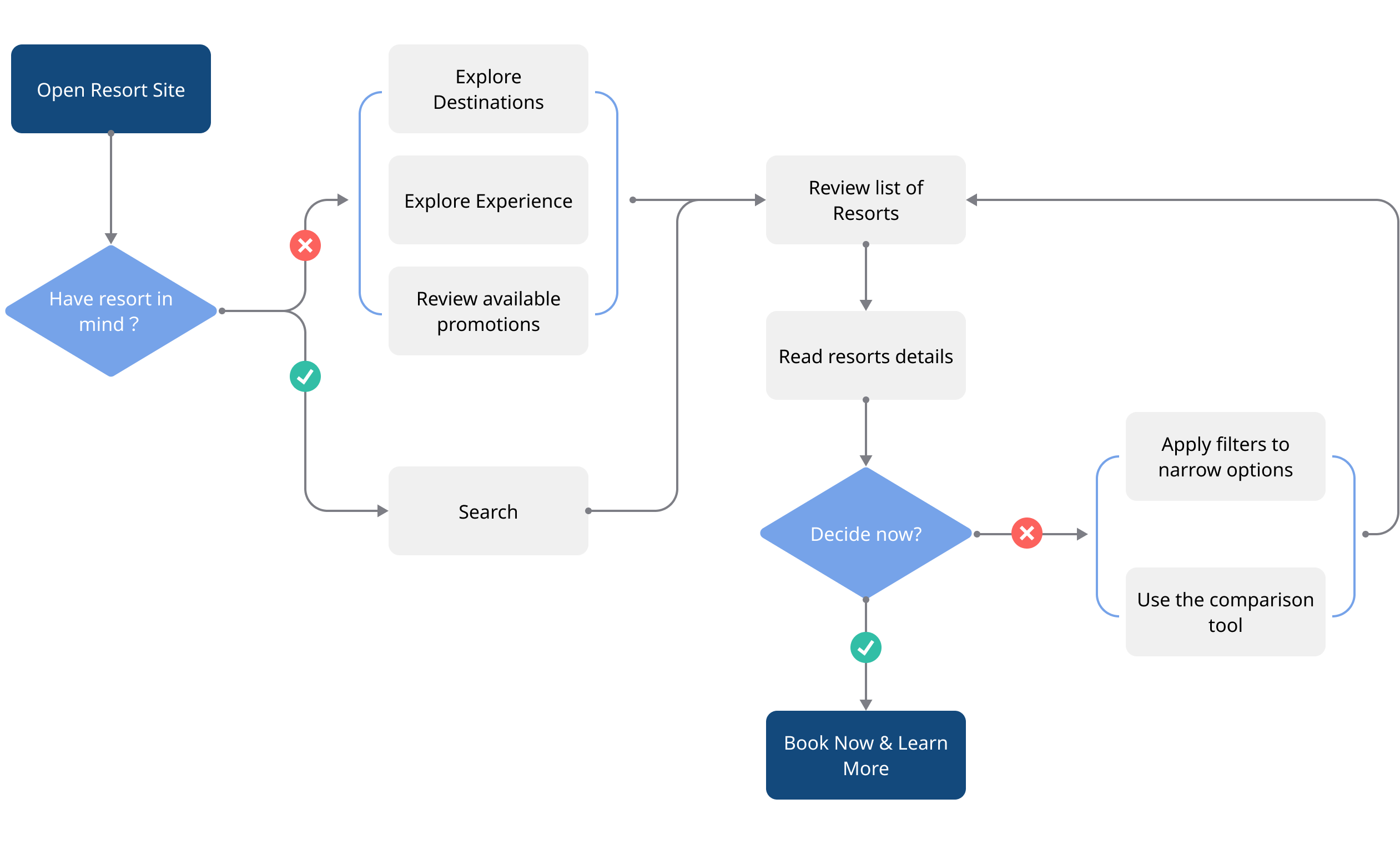
We studied the current user flow of the website and analyzed how this flow could be improved.
Our ultimate goal is for the user is to either:
We decided to first design the main flow that applies to both desktop and mobile devices. To do it, we created the page flow on the desktop scale because it was easier to make design decisions with an existing desktop version as reference. Then, we will replicate the flow on the mobile design with reasonable variation specifically tailored to the mobile experience. Below was our first iteration of the desktop wireframe.
One big difference between mobile and desktop websites is how users interact with the interface. On the desktop website, users are familiar with hover interaction and are more willing to use their mouses to click around. However, on the mobile device, people almost only want to scroll. As a result, contents are hidden in the folded menu rarely get a chance to be viewed. Because of that, we made design changes as below:
This allows for easy selection while providing a comprehensive list of destinations. The map requires a large screen space and complicates that interaction.
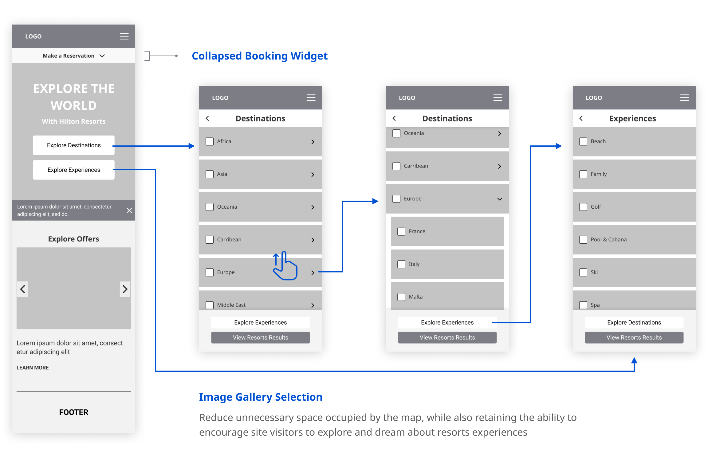
The majority of our participants said they would not use this feature on mobile because they are merely "browsing through the options". They would refer to the desktop for more important, detailed decisions.
After having our wireframes, we reviewed with clients, and get feedback from other designers inside the company. Digested all those feedbacks, we created visual components based on our client’s branding, icons, and style guide.
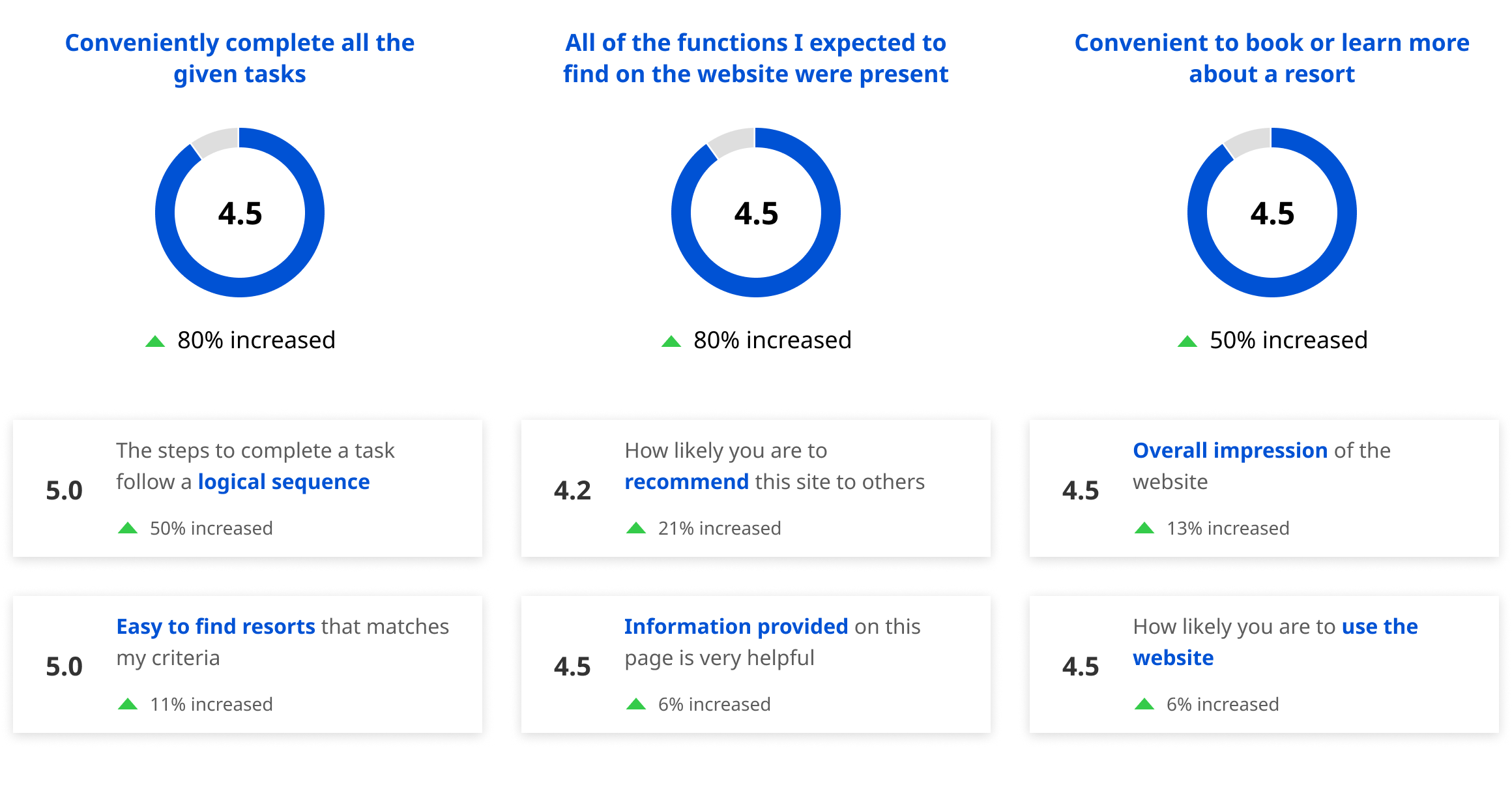
After creating the finalized version of our prototype, we conducted user tests on both the current and new designs to benchmark several usability ratings. The most significant increases in the ratings demonstrate enhanced usability of the website (the ability to complete tasks, availability of expected functions, and convenient booking experience).
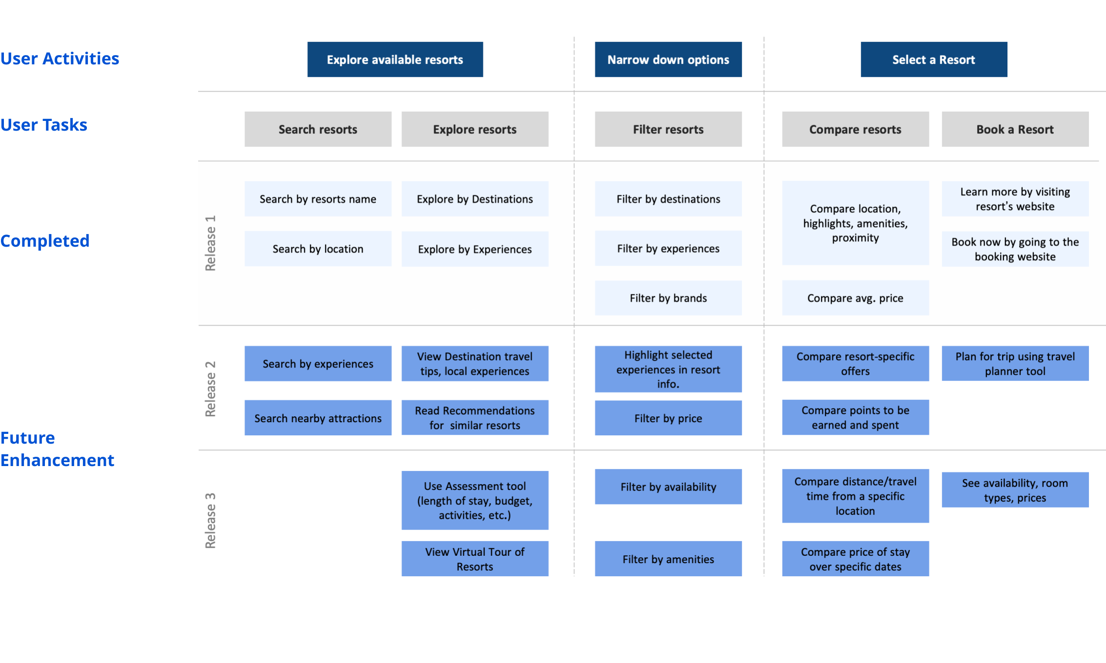
To conclude our redesign project, we proposed a long term Road Map for further enhancements of the website— including several features that could be included to better support the user tasks.